Star Trek: The Next Generation – The Space Between #2
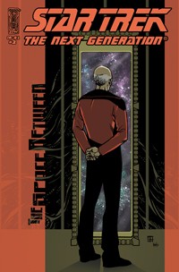 |
Publisher: IDW Publishing Series: Star Trek: The Next Generation Issue: #2 Date: February 2007 Title: The Space Between Writer: David Tischman Artist: Casey Maloney Cover artists: Jeremy Geddes, Zach Howard Stardate: 45315.1 |
Synopsis: Following Ambassador Spock’s decison to stay on Romulus, Picard takes a week off in the ruins of an ancient city on Rajatha Prime with old friend, Dr. Marjorie Devarona. The dig team finds the wreckage of a two-hundred year-old Starfleet shuttlepod and five valuable harmonic diamonds with skeletal remains of the pod’s occupants. The diamonds divide the archeological team and the killing begins. Picard must solve the puzzle of the diamonds and the dig before he becomes the next victim. Meanwhile, back on the Enterprise, Dr. Crusher and Counsellor Troi experience a little Saturday night fever.
|
David Tischman and Casey Maloney take us to an impressive rainforest planet complete with ancient ruins, NX-era shuttlepod remains, skeletons, singing diamonds, Andorians, Bolians and Bajorans, oh my. But that’s not what’s got Troi worked up. It turns out that Beverly is a doctor and a disco diva. Of course, Troi joins in the fun.
The B-story is amusing, but this issue features Picard solving a mystery and almost getting killed while on vacation for a week. Captain + Vacation = Trouble. You’d think Starfleet would’ve figured this out by now. Once again, we’ve got a story with the feel of a television episode. There is a bit of action, a bad girl, and an arrival in the nick of time. What more could you ask for? Now that the first issue of IDW Publishing’s Star Trek: The Next Generation mini-series has disappeared from shelves at local comic shops and the second issue is about to arrive, I’d like to add some followup commentary to my review of issue #1. Reviews from around the blogosphere and at various Star Trek forums are about what I expected. Most reviewers agree that writer David Tischman captured the essence of the first season TNG and penned a story that could easily have been a televison episode. Casey Maloney’s art has drawn mixed reactions. His technique is very different from past incarnations of Star Trek comics. Artists like Gordon Purcell and Jerome Moore are revered by Star Trek comics fans and are frequently held up as examples while discussing The Space Between #1. There’s no question that past artists have done exceptional work, but I find Maloney’s work both different and interesting. |
 |
IDW typically publishes variant covers for every comic. It looks like each issue of The Space Between will have art and photo covers for regular distribution and one or more retailer incentive issues with variant covers. Dennis Calero’s art for issue #1 is a fine introduction to the new line of comics and has been widely praised. The incentive covers by Zach Howard offer a different perspective on the characters. As for the photo covers, well, they’re photo covers. GRINNNDDDD. That’s the sound my teeth are making, because I have a compulsion to buy every variant issue.
IDW has assembled an enthusiastic crew of creators and I’m hoping for a long run. Personally, I feel that diversity is a good thing in comics as well as in life. I’m looking forward to more of the different from IDW.
This issue will have four covers and there have hints on the web that there is something tying together the six issues that will make up this mini-series.
Kent
February 18, 2007 @ 9:07 pm
Like your blog! I’m a big ST fan, but I’m sorry, every piece of art, with the exception of the first cover with all the ships has been CRAP, the insides included.
mark
February 19, 2007 @ 7:39 am
Don’t mince words, Kent. What do you really think? I know that some folks are unhappy with the art, but I can only hope that there are enough who like it and buy the comics, to keep them going.
Jake
February 20, 2007 @ 8:47 am
Ihave to agree with Kent, I’m a long time fan ST fan, I’ve picked up all the books they’ve put out so far but the only art I’ve liked is issue #1,the Dennis Calero stuff I hate when comics start out with a strong first issue to get readers hooked, and then follow it up with crap.
Kent
February 20, 2007 @ 3:48 pm
“What do you really think? I know that some folks are unhappy with the art, but I can only hope that there are enough who like it and buy the comics, to keep them going. ”
I forgot that you should censore yourself on a blog. I don’t see a need to make ST comics if they’re going to look like this, sorry.
Bernard Doddema
February 22, 2007 @ 4:16 pm
Great issue. The story is definitely reminiscent of TNG episodes…something the old comics couldn’t quite carry through. As for the art, I’m still getting used to it. I just can’t get over how it sometimes reminds me of “Clone Wars” comic art. Pull in the guy who did the cover art for issue #1 and there might be less complaints (Dennis Calero).
I did see the pencil work from issue #3 and it looked amazing. I’m wondering if it’s the colors that are mucking things up.
Great review, by the way. Nice to see.
George
March 11, 2007 @ 3:02 am
I bought the first one, read it. The story was fine but the art was so bad I will not buy another.
Anthony Pascale
June 5, 2007 @ 5:48 pm
mark,
i enjoy your trek reviews. can you email me about doing reviews on my site?
| goodtrek.info
September 29, 2007 @ 2:16 am
[…] good reader gone bad ” Star Trek: The Next Generation – The Space … good reader gone bad. Star Trek: The Next Generation – The Space Between #2 … around the blogosphere and at various Star Trek forums are about what I expected. … […]