Twitter’s CEO Dick Costolo has called the popular microblogging service “the pulse of the planet.” With a little less than eight percent of the world’s population on Twitter, that pulse has room to grow. Nevertheless, recent big data research into the geography of the Twittersphere sheds light on where users tweet, with whom they tweet, and what information they share. The findings illustrate that Twitter helps people transcend geographic boundaries that restricted communication in a pre-digital age.
A research team from the University of Illinois at Urbana-Champaign examined location data from the Twitter Decahose, which includes 10 percent of tweets sent on a given day. The team examined more than 1.5 billion tweets sent from more than 71 million unique users over 39 days and documented its findings in a paper published online.
Extracting Location from Tweets
Twitter displays the long-tail phenomenon of user participation: 85 percent of tweets come from the top 15 percent of users, and one-fifth of tweets come from just one percent of users. Only 3 percent of tweets are georeferenced, meaning their metadata includes location information. Echoing the long-tail, two-thirds of georeferenced tweets come from one percent of users, representing a small subset of Twitter users.
Researchers dramatically expanded the number of located tweets through geocoding. They analyzed information from user-generated Location and Profile fields and inferred location for more than one-third of tweets from the Decahose. These fields remain fairly static as a user tweets, so future researchers may be better off geocoding users rather than tweets. This could simplify location-based Twitter research by reducing the number of data points to analyze, saving time and computing power.
Though Twitter users communicate in a variety of languages (the most multilingual areas being Hungary, Serbia, Lebanon, Israel, and the West Bank), they tend to provide their location data in English.
Where Do People Tweet From?
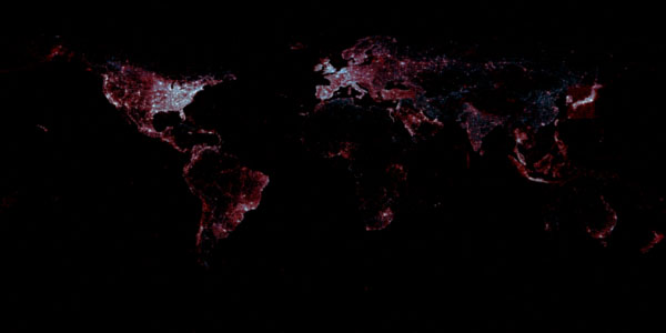
Where electricity exists. The map below overlays georeferenced tweets with NASA Earth’s City Lights images. Red dots represent georeferenced tweets, blue dots represent access to electricity, and white dots represent an equal balance of tweets and electricity.

Red dots represent georeferenced tweets, blue dots represent areas with electricity, and white dots represent both. Image via First Monday/Leetaru, et al. Click image for high-resolution version.
The map reminds us that accessibility to digital tools still relies on accessibility to tangible infrastructure, though the proclivity of red illustrates that people tweet even when electricity is scarce. (The box around Japan reflects some tweets from boats but is also the relic of old third-party Twitter clients that “handled the country’s polygonal shape a bit oddly,” Leetaru explained in an email).
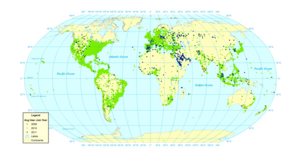
Most georeferenced Twitter users joined in 2010 (shown in green on the map below), with concentrations of European, Middle Eastern, and Southeast Asian users joining in 2011 (shown in blue on the map below).

Green dots represent georeferenced users who joined Twitter in 2010 and blue dots represent georeferenced users who joined in 2011. Image via First Monday/Leetaru, et al. Click image for high-resolution version.
Who Do People Communicate With on Twitter?
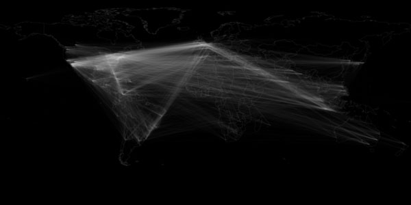
People on Twitter retweet and reference close-by and far-away users at almost equal rates. A map of geocoded retweets reveals patterns among continental communication. The researchers write:
“Latin America is more closely connected to Europe than to the United States, while Asia connects more closely to the U.S. and the Middle East connects to both the U.S. and Europe. The east coast of the United States is a clear nexus point for the country, through Europe appears to be more dominant than the United States in producing content retweeted by the rest of the world.”

This map shows the location connections between users who retweet other users. Image via First Monday/Leetaru, et al. Click image for high-resolution version.
Research from 2012 showed Twitter users tended to follow people geographically close to them and those located in areas easily accessible by flight. That paper examined pairs of followers, but the University of Illinois team maintains that retweets and references to other users are better indicators than followers of how much a user pays attention to another user’s tweets.
What Do People Share on Twitter?
Mostly social media. More than half of all links in tweets go to six domains: Twitter, Instagram, Facebook, YouTube, ask.fm, and Tumblr. Only 7.8 percent of all links people share on Twitter reference English mainstream news. The most popular sources for English-language news on Twitter include the BBC, Huffington Post, New York Times, and Guardian.
People link to articles about close-by and far-away news at almost equal rates. The map below compares regional references on Twitter and in Google News’ RSS feed. Blue dots represent more georeferenced Twitter coverage, red dots represent more mainstream media coverage, and white dots represent equal coverage.

The blue dots represent Twitter coverage of an area and the red dots represent mainstream media coverage of an area. Image via First Monday/Leetaru, et al. Click image for high-resolution version.
Twitter appears to cover more information on Latin America and Eastern Europe, while mainstream media covers Africa, South Asia, and East Asia more thoroughly.
The most influential users, based on Klout score, concentrate in Malaysia, Indonesia, France, Spain, the U.K., the U.S. and Venezuela. The least influential, meaning those whose content is least likely to spread around the Web, reside in Eastern Europe, the Middle East (especially Turkey), India, and Southeast Asia.
Want to see more Twitter visualizations? The company crunches its own data and posts visualizations on its Flickr page.

Pingback: Taking the pulse of the planet: How Twitter erases geography — Tech News and Analysis
Pingback: Taking the pulse of the planet: How Twitter erases geography ← techtings
Pingback: Twitter’s Geography: Visualized and Explained | Internet Monitor | Netgreen
Pingback: Taking the pulse of the planet: How Twitter erases geography | News From Twitter
Pingback: Türkiye Twitter Üzerinden İçerikleri En Az Paylaşılan Ülkeler Arasında | Sosyal Medya
Pingback: The Tweets Heard Around the World | Web Guru Guide
Pingback: The Tweets Heard Around the World | News From Twitter
Pingback: Taking the pulse of the planet: How Twitter erases geography « Tony Rocha Official Blog
Pingback: Taking the pulse of the planet: How Twitter erases geography | BaciNews