
Billions of tweets. Millions of check-ins. How can we make sense out of such staggering amounts of data? One answer: Maps.
Social media companies and researchers use map-based visualizations to link virtual information with the physical world, surfacing patterns of human behavior that dazzle and educate.
Twitter’s data science team recently visualized all geotagged tweets in two and three dimensions. Both reveal where tweets concentrate, two-dimensional geography maps through color and three-dimensional topography graphics through peaks and valleys.
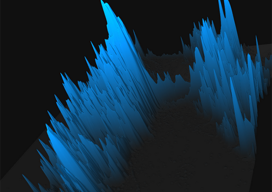
Spikes of tweets tower over New York. Screenshot from Twitter blog. (Click image to see original.)
Foursquare created a zoomable map of 500 million check-ins and time-lapse videos of check-in data from New York and Tokyo. For the introspective or quantified selfers, a company called Etch will create a personalized map of individual Foursquare users’ check-ins.
Yelp used keywords from reviews on its site to visualize restaurant types in various cities. (For patio dining in Boston, head to Harvard Square or the Back Bay and prepare to run into hipsters.)
This visualization technique extends beyond real-time social media data. The New York Times mapped user suggestions of quiet spaces in the city. The Guardian displayed an interactive map of global protests that occurred this year. Last year, University of Illinois researcher Kalev Leetaru mapped the sentiment of Wikipedia articles to show emotions around history over the past two centuries.
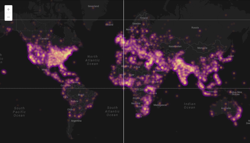
Global protests in 2013. Map by John Beieler and Josh Stevens, screenshot from The Guardian. (Click image to see post.)
In his book Rewire: Digital Cosmopolitans in the Age of Connection, Ethan Zuckerman compares infrastructure maps, which show what’s possible, to flow maps, which show what occurs. Unsurprisingly, most of the data shown on these maps hews closely to physical borders and man-made developments such as roads. But these maps also reveal the contours of behavior: where people like to announce their presence or grab a bite to eat.
Such maps can help us better understand cities, society, and human behavior, said Visualizing.org founder Adam Bly in a 2011 South by Southwest Interactive presentation. Comparisons of where tourists and locals snap photos help urban planners, business owners, or local chambers of commerce interested in economic development. Mapping fast food and healthy food locations offers insight to public health officials, teachers, and policy makers who want to ensure access to nutritious food. Analyzing mobile phone data and realizing that human movement is 93 percent predictable influences where public transportation or energy grids should go.
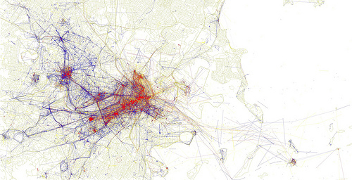
Visualization of photos taken by locals (blue) tourists (red) and both (yellow) in Boston. Eric Fischer/Flickr, CC BY-SA 2.0
As cheap data storage abounds and visualization tools proliferate, maps offer a window into how humans live, in addition to guidance on how to get around.