Lean Startup vs. Lean Media

Yesterday, I participated in a live video discussion about my Lean Media book. One of the topics that came up was the relationship of the Lean Media framework to Lean Startup, a business and product framework first articulated by Eric Ries nearly ten years ago. He ended up releasing a book titled Lean Startup, and the concepts outlined in it are now widely followed by tech startups and business units at larger companies. (Eric expands on how some of these innovative concepts can be applied to larger ventures and multinational corporations in his new book The Startup Way).

I’ve acknowledged Lean Media’s connections with Lean Startup since I first proposed the Lean Media framework right here on this blog five years ago, but it’s worth exploring in greater detail how they differ. To some, the two iterative product development frameworks may seem similar, but there are some profound differences, too.

The following chart lays it all out:

Lean Startup vs. Lean Media chart
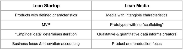
In the first row, Lean Startup addresses products with defined characteristics – a light bulb or SaaS application. In certain cases there may be design elements, such as a smartphone case or pair of shoes, but at the end of the day such products also serve practical purposes, such as protecting your phone or your feet. They therefore have practical value and can be assigned a price. They can also be designed and produced in a methodical fashion, building out components and features to reach the desired specification. Lean Startup’s build-measure-learn cycle brings in customer feedback to improve development of products with defined characteristics.

Media products, on the other hand, are designed to entertain and inform. In certain cases they may have knowledge value (e.g., a subscription to the Financial Times informs business people about issues that impact their careers) but in most cases they bring no tangible value. Media is all about intangibles — the hard-to-articulate qualities of work that elicit feelings and emotions in the people who experience them. Despite media’s lack of practical value, audiences are willing to spend one of their most valuable resources — time — to consume them. They may also spend a great deal of money on media experiences.

MVP vs. Media Prototype

The MVP (minimum viable product) is perhaps the most famous element of Lean Startup. The concept has also been debated, as I discussed on this blog in 2013 (see MDP: Minimum Delightful Product) and I have heard elsewhere. Ideally, it’s a functional product that can be shown to early adopters in order to test hypotheses and get feedback, but some founders expand the definition to include incomplete models or design prototypes, and often end up showing them to people who are not early adopters, such as journalists or prospective investors. MVPs are by definition not finished products, but early customers (or observers, investors, etc.) may have a hard time seeing past the flaws.

Lean Media does not use the term MVP. We already have lots of terms for early versions of a work — draft, rough cut, demo version, etc. — but in the book I group them all under the term prototype for all media formats. While early prototypes may be simple or incomplete, I instruct creators to be sure to remove from the media prototypes what I call scaffolding before showing them to test audiences. Scaffolding could include editors’ marks, time codes, and annotations that will distract from the work.

In the third row, Lean Startup relies on empirical data and validated learning to test hypotheses. An MVP might provoke some discussions with early adopters, but in the build-measure-learn cycle you need to be measuring what you are doing so you can make an informed, data-driven decision. For instance, will customers prefer a recessed headlight in the new car, or something that’s more flush with the front of the vehicle? Have your design team whip up some graphic renderings in their CAD programs, and then show them to prospective customers and measure which one gets more votes. It’s the classic A/B test.

For media, quantitative data can deliver insights as test audiences experience a prototype, but qualitative data explains why people feel the way they do about a media work being developed. Sometimes the quantitative indicators (20 “thumbs down” vs 10 “thumbs up” after reviewing a draft manuscript of a novel) may be invalidated by the qualitative feedback (75% of thumbs down concerned minor issues relating to chapter titles and the index, as opposed to fundamental issues with the story itself).

Regardless of the type of feedback, it’s intended to inform creators about the work, rather than dictating how they must proceed. This is a big difference with Lean Startup, which practically requires founders to follow where the empirical data takes them, even if it’s far outside their original hypotheses about what customers want.

Finally, Lean Startup is not just a framework for product development, it’s a framework for startup business development. For instance, in Lean Startup, Ries describes innovation accounting as a way for the company to reach its business goals. Lean Media has no such intentions — the framework is purely about product. While a media work that resounds with audiences can be the basis for a successful media venture, I do not explicitly address how to make a media business profitable. That may very well be the focus of my next media book (working title: Niche Media). Stay tuned!


Crowdsourcing book design vs. using experienced professional book designers

Earlier this year, I started a project to redesign the In 30 Minutes book series. There were several reasons for this, including:

  1. Dropbox GuideThe existing design, while eye-catching and effective, was beginning to look a little dated.
  2. There were some issues around placement of template elements, such as the large clock taking up too much space to fit in a long subtitle (see the inset sample).
  3. A desire to have a new, more modern look in preparation for expanding distribution of the series to retail and other outlets.

Every publisher knows that relaunching or redesigning a publication is a big deal. That’s true for books as well as websites, magazines, pamphlets, and other types of media that have a visual identity. Oftentimes there are restrictions or requirements associated with the redesign that require special attention, such as wanting to preserve a color scheme or design element. Think of the Apple logo, which has undergone several iterations over the past 40 years. For much of the time, the apple symbol has remained constant even while the colors and depth have changed.

For my books, the existing designer declined to take on the job — it would take a lot of effort, and as a full-time graphic designer with a well-known magazine publisher he did not have the bandwidth to devote to the project on nights and weekends.

So I tried using a design crowdsourcing service called 99designs. The idea is the customer pays a flat fee for a design template, and then designers all over the world compete by submitting bids. Here are some of my observations about choosing 99designs from last May:

The concept is not without controversy, and many experienced designers don’t participate — it goes against their beliefs about the client/designer relationship, the prize doesn’t come close to their standard rates, and there’s a real chance they may not win. But it opens some doors for younger designers, as well as designers from other countries who otherwise would have a tough time recruiting clients outside of their regions.

I liked it because it gives me the chance to see ideas from lots of different designers, and moves fast — the contest can wrap up in about a week. So I decided to give it a shot.

There were a lot of submissions and ideas from the designers participating in the contest. I eventually chose a winner … but decided not to use the design. It was good, but it was missing depth. It also did not seem so flexible for books with longer titles or subtitles.

Friends in the publishing industry were helpful in giving feedback and also recommending some professional designers. I eventually chose TLC Graphics and have been very happy with the results. You can see the new look in the design for one of the first books that will carry it, iPhone 6 & iPhone 6S In 30 Minutes:

iPhone 6 and iPhone 6S BookThere are other color combinations in the works as well:

Four new book cover designsThe old covers are gradually being switched out. For some books, the interiors are being completely revised, including LinkedIn In 30 Minutes. I hope to have the entire process done by spring 2016.

In summary, while I am glad I tried a crowdsourced service and the price was reasonable, for the series designs a dedicated professional book designer has worked for me each time I have updated the look and feel of the books (first in 2012, and now in 2015). Besides looking better, I feel that the designs also had the necessary flexibility required for this type of series.

I am happy to discuss my experience with 99designs and working with professional designers in the comments section below.


Solving the Twitter retention problem

Twitter In 30 MinutesThis week, I released the second edition of Twitter In 30 Minutes. It’s a Twitter book that covers the basics, starting with registration and working its way up to more advanced features such as hashtags and lists. In this post, I would like to talk about a surprising research finding about Twitter retention data that I stumbled upon while preparing the latest edition.

This Wall Street Journal blog post from April highlighted the Twitter retention data, which had been gathered by Dutch firm Twopcharts:

A report from Twopcharts, a website that monitors Twitter account activity, states that about 44% of the 974 million existing Twitter accounts have never sent a tweet.

An earlier WSJ blog post based on Twopcharts data noted that only 11% of the Twitter accounts created in 2012 were still tweeting more than a year later. Twitter subsequently restricted Twopcharts’ access to Twitter data, and a senior executive later claimed Twitter was “happy” many users decided not to tweet — in other words, Twitter viewed some of this inactive population as passive consumers of Twitter, rather than active participants.

Regardless of Twitter’s spin, Twitter has had a problem for years getting people to participate in the service after they’ve signed up. Despite adding tips and constant reminders to tweet and follow other accounts, lots of users have trouble figuring out what to do once they are plunked down in a firehose of short messages, random photos, trending topics, and mysterious Twitter syntax. As the WSJ blogger indicated, millions simply give up.

Solving the Twitter retention problem, one reader at a time

Some of them ended up coming to my Twitter guide. While the first edition of Twitter In 30 Minutes targeted totally new users, I found out that many of my readers already had accounts, and had trouble getting the hang of Twitter. They used the guide to boost their efforts and figure out the more confusing elements of the service.

For the second edition of Twitter In 30 Minutes, I wanted to make sure that I served these two audiences (totally new users, vs. people who already have an account). I tightened the focus around these three elements:

  1. The importance of a good network on Twitter.
  2. How engagement takes place, using examples from real life.
  3. Best practices for creating Tweets, posting photos, and participating in discussions

I also completely redid the screenshots. Many of the first edition screenshots were rendered obsolete after Twitter updated its interface earlier this year.

How to downgrade Hootsuite Pro accounts

If you’re frustrated with Hootsuite Pro, or no longer need to use the extra Hootsuite Pro features such as managing more than 5 social media accounts, you may be wondering how to downgrade Hootsuite Pro. This post explains how to do it.

Why I downgraded my Hootsuite pro account

A little backstory: I’ve used Hootsuite for more than three years, and signed up for Hootsuite Pro earlier this year when my business reached the stage where the free Hootsuite account was no longer enough. The In 30 Minutes series was exploding, and with new titles such as this book about LinkedIn, I had too many social media accounts to look after. They included about five or six Twitter accounts, plus my LinkedIn profile and company page, Facebook profile, and several Facebook pages for the LinkedIn title and other In 30 Minutes guides. The $9.99 monthly price for Hootsuite Pro was worth it.

That is, until Hootsuite changed a critical feature for me and other Pro users: The social network selector. I won’t get into how it worked here, but you can read my “Hootsuite sucks” post and the follow up (“Hootsuite takes the low road, blames complaints on ‘fear of change’“).

After a week of struggling with the new user interface, I decided Hootsuite Pro was no longer worth it, and switched back to the free version of Hootsuite. Here’s how to downgrade Hootsuite Pro:

1. Click on the Settings icon in Hootsuite (which looks like a gear on the left side of the browser window) and click Accounts:

Hootsuite Pro account settings
The Hootsuite Pro interface

2. The Settings window will appear. You will see your profile information. On the right side of the pop-up, is a button that says “Downgrade”. Press it.

3. You will see your billing summary. At the bottom of the page is a tiny link that says “Downgrade to Free” (see screenshot below). Click it.

Downgrade Hootsuite Pro

4. You will be warned about the Pro features that you no longer have access to, such as 6 or more social media accounts or extra RSS feeds. Click the buttons to manage them, or go back to Hootsuite’s settings to unlink social media accounts, get rid of reports, and decouple RSS feeds.

5. You’ll have to start again at step 1. Follow the steps, and then click through the prompts that basically ask you to confirm that you want to do this:

Hootsuite Prompt

6. Click “Save And Proceed” and you’ll eventually get a confirmation that you are done … and one final prompt to give your feedback. The confirmation says that you will be pro-rated for time not used during the current billing period.

If you have problems with downgrading, or you still get billed, I suggest using Twitter to contact @hootsuite_help.

Ebook #2 hits the virtual shelves

Google Drive manual
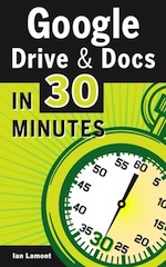
Earlier this week, my second ebook was published in the Kindle Store and as a paid PDF download (see inset cover). The book explains how to use Google Drive, a very powerful online software suite that includes word processing, spreadsheets, a presentation tool, and online storage. It’s kind of like Google Docs for Dummies … but not quite!

If you visit the product page, you’ll see that the price point is higher than my first book, a Dropbox guide. There are a few reasons for this:

  • The new title is about 1/3 longer, and more comprehensive.
  • It reaches to a more business-focused audience, as the Google Drive suite contains two programs that are seldom used by home users: Spreadsheets (which has similar functionality to Microsoft Excel) and Presentations (which is a bare-bones PowerPoint clone with some neat online functionality thrown in). (Update: Google has since renamed these programs Sheets and Slides, respectively.)
  • I want to test the response rate to higher-priced ebooks.
  • I want to see how high-value affiliate offers work. I’m currently allocating 56% of the $17.99 cover price to affiliates enrolled in my hosting company’s affiliate program. This translates to $10 per affiliate, compared to under $3 per affiliate for the Dropbox manual affiliate program. (Update: I killed the affiliate program. Too much room for abuse as the incentives aren’t aligned with what I want to promote … quality!)

Experimental mode for ebooks

As you can see, I am in experimental mode when it comes to design, pricing, length, and other aspects. The prices and affiliate program percentages will likely change as I figure out what works, and what doesn’t.

In the meantime, stay tuned for book #3! I have also started to consider other topics, ranging from Excel to LinkedIn and even other technical topics. I won’t be the only author, though … the best way to achieve scale is to find other talented authors who know these technologies and have existing audiences through blogs or other writing arrangements.

A new way to browse Craigslist

Next month, my company plans on releasing the first version of our Craigslist app. It’s not going to be complicated (in fact, this early release will only let users buy on Craigslist with an iPhone or iPad), but we think it serves a big need in the marketplace. On a PC, Craigslist’s Web interface is oriented toward text. The Invantory app is really oriented toward photos, as you can see from the screenshot below:

Craigslist bike listing

If there are more than two photos, all it takes is a horizontal swipe of the thumb to see the other photos. The other innovation relates to browsing: Instead of reading text lists, users are presented with thumbnails. This makes it much easier to visually identify items of interest and skip over items that are of no interest.

We’re excited about the app and hope you can give it a spin.

Classifieds app UX

How many classifieds apps are out there? In my review of Craigslist Mobile, I observed about a dozen in the Apple App Store and 20 in Android Market (aka Google Play). Why they exist is not a surprise — Craigslist is the most popular local classifieds marketplace in existence. But what I did find surprising were the poor design, user interfaces and user flow (collectively known as user experience, or UX) that had gone into the apps. For instance, as I noted in the Craigslist Mobile review concerning the classified app UX:

” … The Craigslist Mobile UX is not helped by placing all required fields right next to each other on the same page, which requires lots of text input and screen manipulation, and increases the chances of making a mistake. The ‘add photo’ button takes users to stored photos on the iOS device; a separate button accesses the camera directly.”

There were many other UX issues identified in the review. Options crowd each screen and are hard to find or activate, users are forced to navigate back to the home screen to change settings, strange color schemes are used, text rather than photos dominates the browsing experience, etc. Some of these issues relate to Craigslist’s requirements for listings, but others are the direct result of choices the app designers made. Despite the crowded field, the designers of other apps often decided to copy what was already out there rather than innovating on UX and differentiating themselves.

Is there any other way to do classifieds app UX? Certainly. EggDrop, Zaarly and Rumgr point the way, with a user-centric (rather than engineer-centric) approach to design, UI, and user flow. There is no clutter on the small screens. Good color choices were made by the designers. Images and maps look sharp. It’s easy to find what you’re looking for, switch views, or change options. This is the way classified app UX should be.

An example of good UX: Zaarly

Zaarly Map