Geo visualization made simple in flash:
Mikel Maron released WorldKit, an swf file which reads config.xml and datafeed.xml to produce a visulaization of the data on the world map (or any map) You must have already seen his near real time blog post visualization, World as a blog (Weblogs.com + ICBM + RSS). He also has an earthquake visualization. Also, here is an image of the population density of the world.
Comments Off on Geo visualization made simple in flash:
 2 Comments
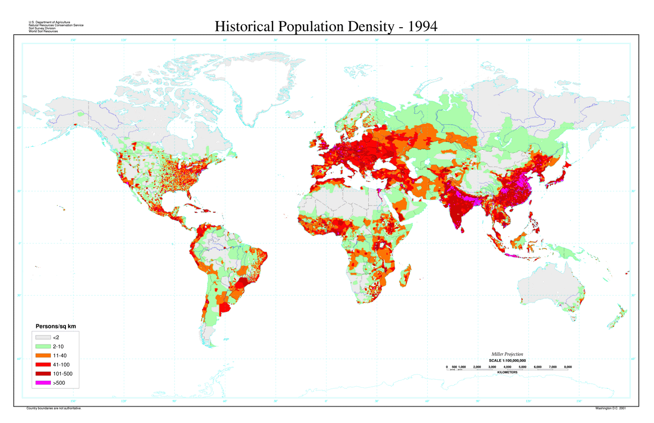